Analyzing the ggcharts CRAN Downloads. Part 2: Data Visualization
Introduction
In part 1 of this post I described how I got data about the ggcharts CRAN downloads. In this follow-up post I will walk you through how to turn this data into an informative visualization using ggplot2 and patchwork.
library(ggplot2)
library(patchwork)
Daily Downloads
The first plot will show the daily downloads over time. I will use a line chart for that purpose. Remember from part 1 that the daily_downloads dataset contains the aggregated number of downloads per day.
p1 <- ggplot(daily_downloads, aes(date, N)) +
  geom_line(color = "#94C1E0", size = 1.25) +
  ggcharts::theme_hermit(axis = "x", ticks = "x", grid = "X") +
  ggtitle("Daily Downloads")
p1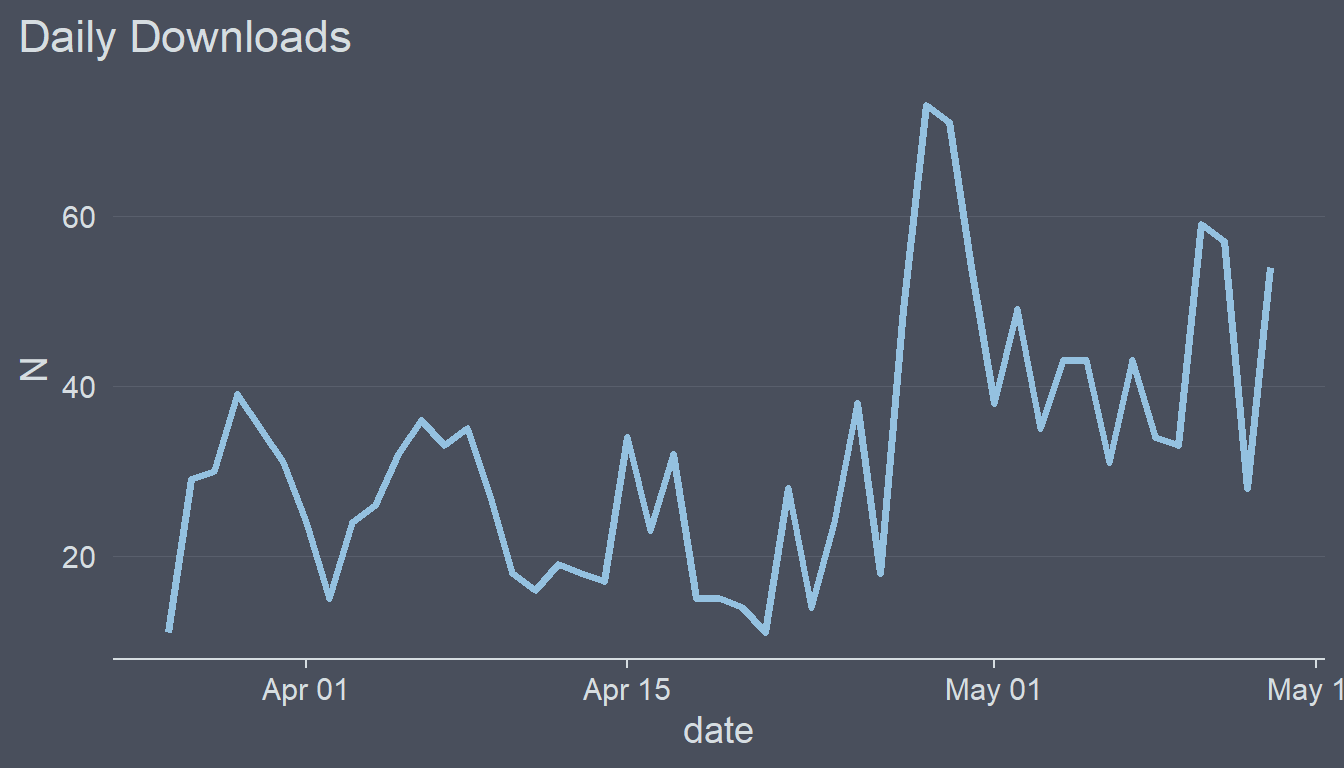
Currently the y axis does not include 0. In addition, the line exceeds the highest values on the y axis which I don’t particularly like. Let’s change this.
p1 + ylim(0, 80)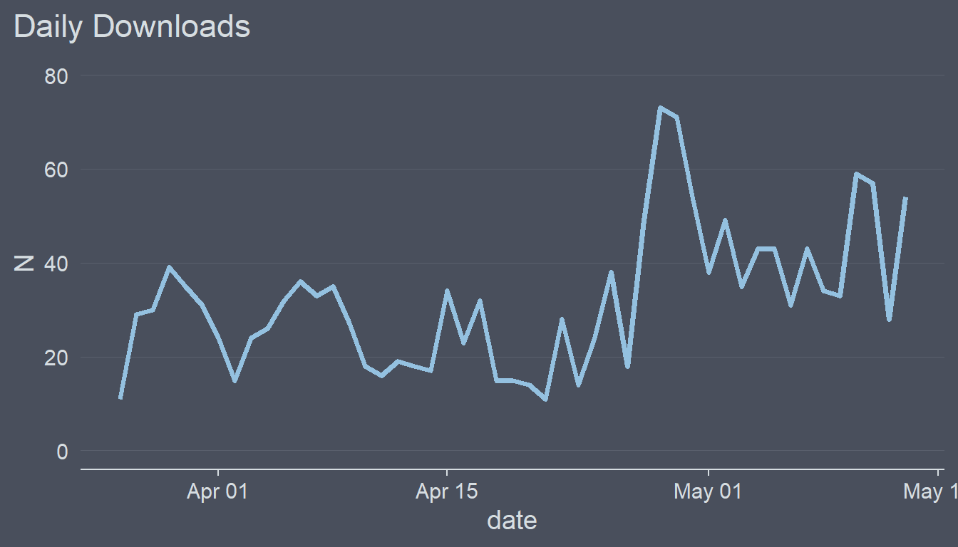
That’s not quite what I wanted to achieve. Notice the gap between the x axis line and the grid line for 0. ggplot2 automatically adds 5% space around the axis limits. This can be changes like this.
p1 <- p1 +
  scale_y_continuous(
    limits = c(0, 80),
    expand = expansion(mult = c(0, .05))
  )
p1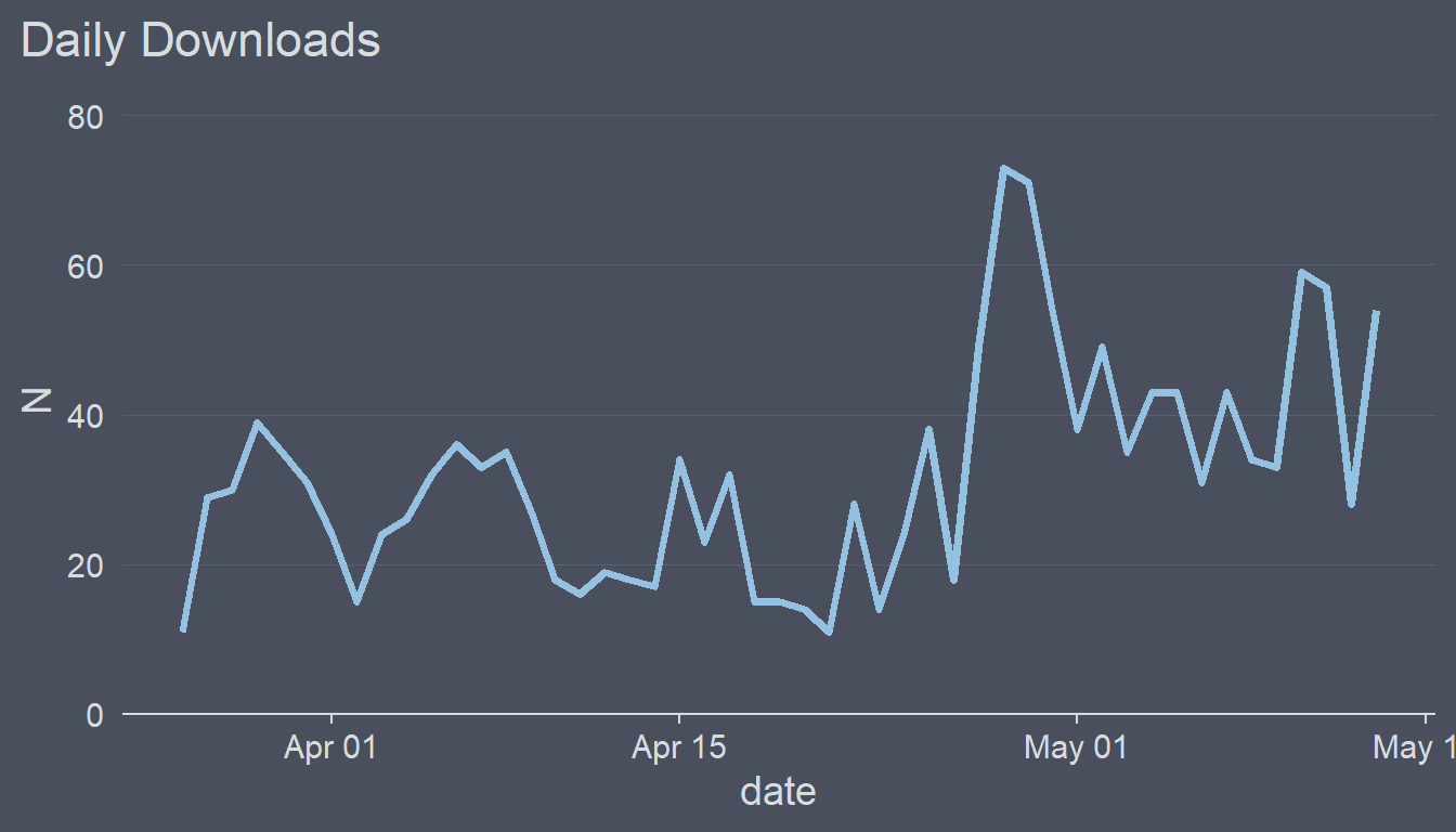
Neat!
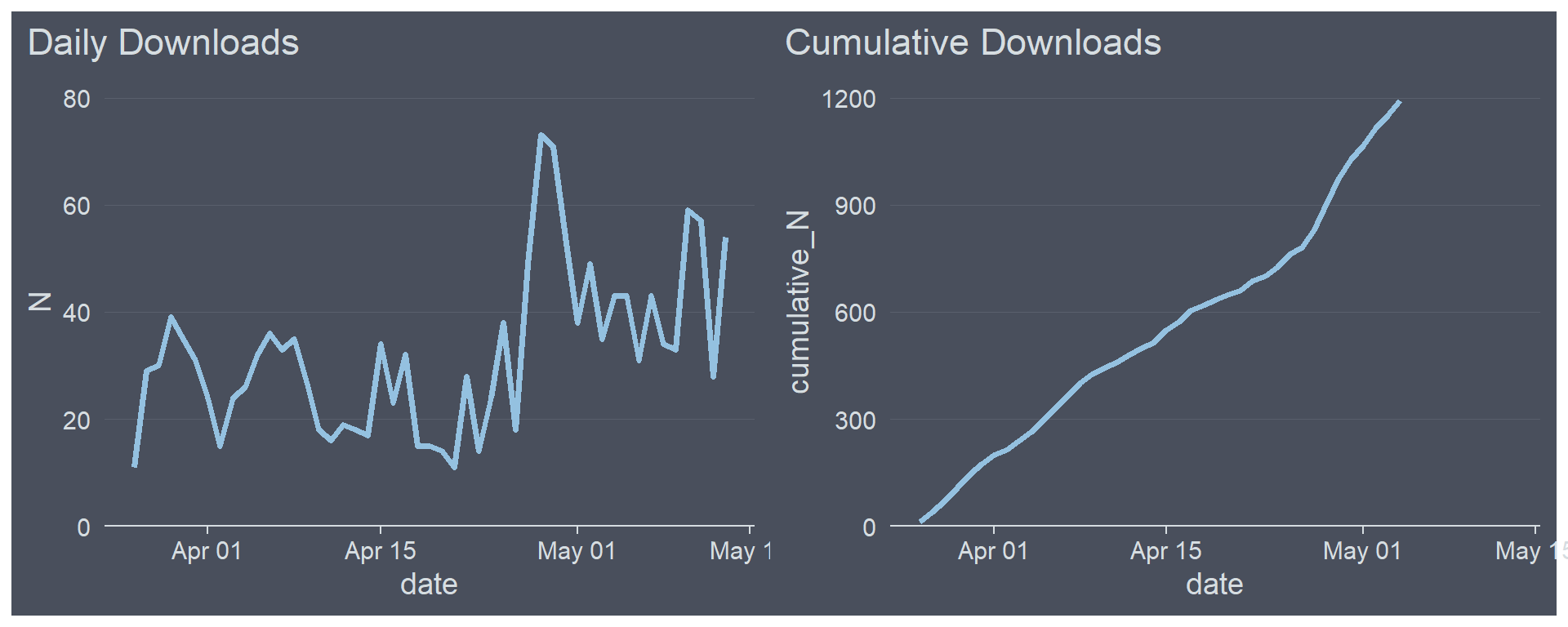
Cumulative Downloads
Next, let’s continue with plotting the cumulative downloads over time. This will be a line chart as well.
p2 <- ggplot(daily_downloads, aes(date, cumulative_N)) +
  geom_line(color = "#94C1E0", size = 1.25) +
  ggcharts::theme_hermit(axis = "x", ticks = "x", grid = "X") +
  ggtitle("Cumulative Downloads") +
  scale_y_continuous(expand = expansion(mult = c(0, .05)))
p2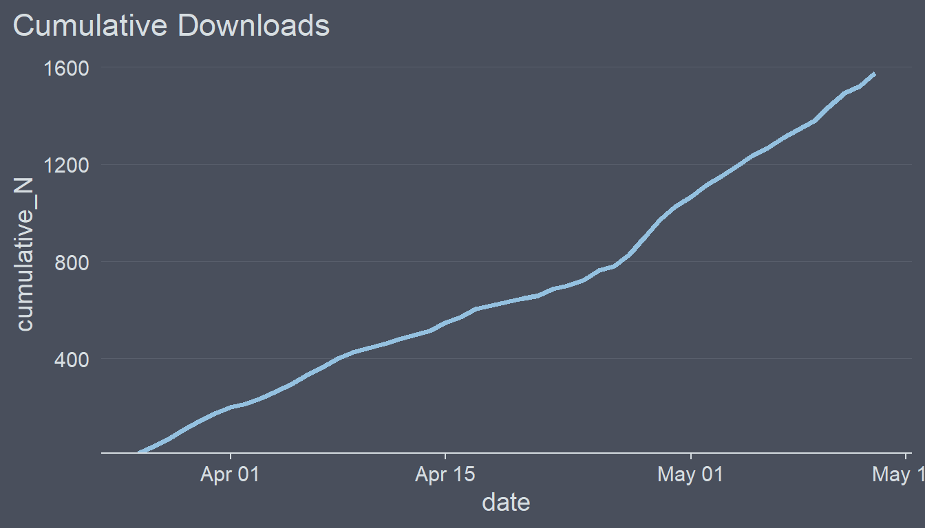
Doesn’t look too bad. However, notice that when I put p1 and p2 next to each other the grid lines and axis annotations don’t align with each other which is very unsightly.
p1 + p2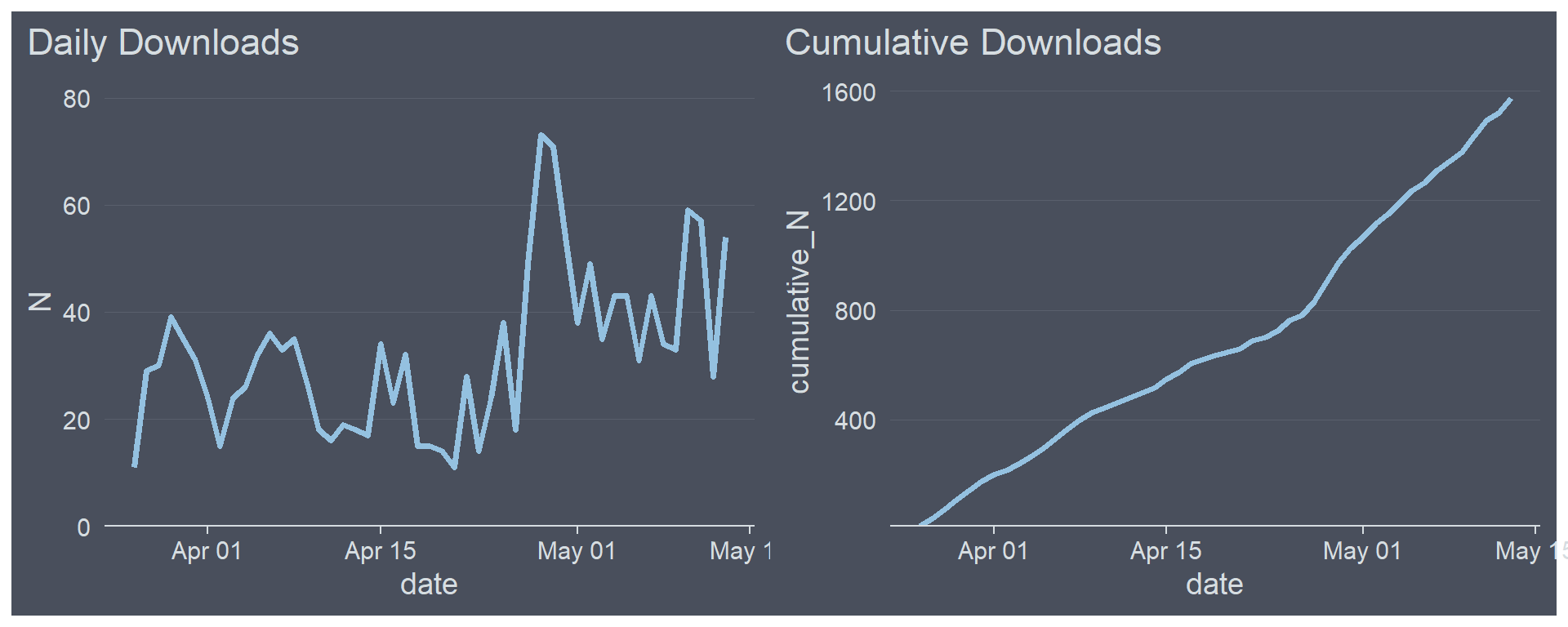
Let’s change this by tweaking the y scale.
p2 <- p2 +
  scale_y_continuous(
    limits = c(0, 1200),
    breaks = seq(from = 0, to = 1200, by = 300),
    expand = expansion(mult = c(0, .05))
  )
When putting the plots side-by-side they now create an harmonious picture.
p1 + p2## Warning: Removed 9 row(s) containing missing values (geom_path).
Distribution of Daily Downloads
The third plot will show the distribution of daily downloads.
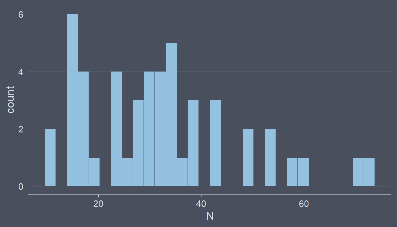
ggplot(daily_downloads, aes(N)) +
  geom_histogram(fill = "#94C1E0", color = "#494F5C") +
  ggcharts::theme_hermit(axis = "x", ticks = "x", grid = "X")
## `stat_bin()` using `bins = 30`. Pick better value with `binwidth`.
When using geom_histogram() by default 30 bins are drawn. You almost never want to leave it like this but rather tweak it by setting the bins argument. After some trial-and-error I chose to go with 10 bins.
p3 <- ggplot(daily_downloads, aes(N)) +
  geom_histogram(fill = "#94C1E0", color = "#494F5C", bins = 10) +
  ggcharts::theme_hermit(axis = "x", ticks = "x", grid = "X") +
  ggtitle("Distribution of Daily Downloads")
p3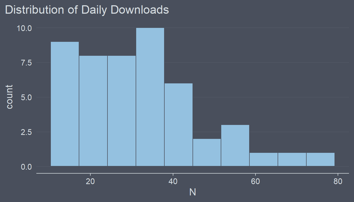
Daily downloads are counts and counts are integers. Thus, to me having decimal numbers in the y axis looks odd. Let’s fix this and in addition get rid of the gap between the bars and the x axis.
p3 <- p3 +
  scale_y_continuous(
    breaks = c(0, 2, 4, 6, 8),
    expand = expansion(mult = c(0, .05))
  )
p3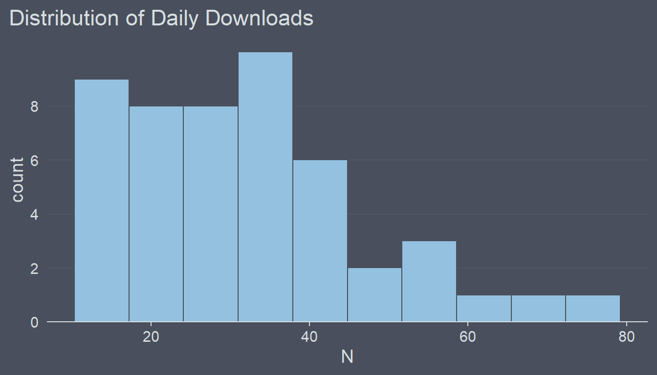
Downloads by Country
The last plot will display the number of downloads by country. Remember from part 1 that this data is stored in the downloads_by_countries dataset.
p4 <- ggcharts::bar_chart(downloads_by_country, country, N, bar_color = "#94C1E0", top_n = 10) +
  ggcharts::theme_hermit(axis = "y", grid = "Y") +
  labs(
    title = "Downloads by Country",
    subtitle = "Top 10"
  )
p4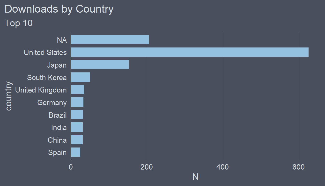
Apparently, there are quite a lot of downloads for which the country is unknown. Let’s turn the NA values into "Unknown".
downloads_by_country[is.na(country), country := "Unknown"]
p4 <- ggcharts::bar_chart(downloads_by_country, country, N, bar_color = "#94C1E0", top_n = 10) +
  ggcharts::theme_hermit(axis = "y", grid = "Y") +
  labs(
    title = "Downloads by Country",
    subtitle = "Top 10"
  )
p4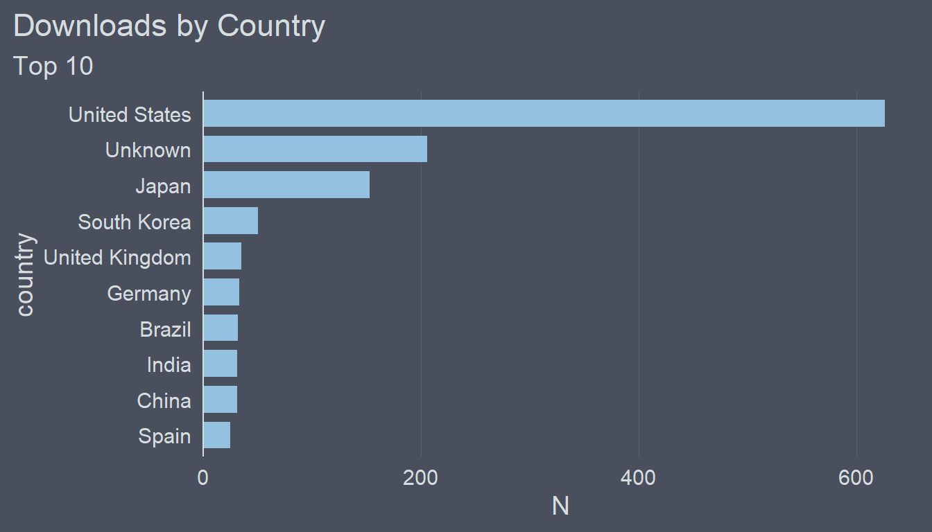
Next, let’s label the bars with the values they actually represent.
p4 <- p4 +
  geom_text(aes(label = N), hjust = -.2, color = "#D6DDE1", size = 5) +
  scale_y_continuous(expand = expansion(mult = c(0, .15)))
p4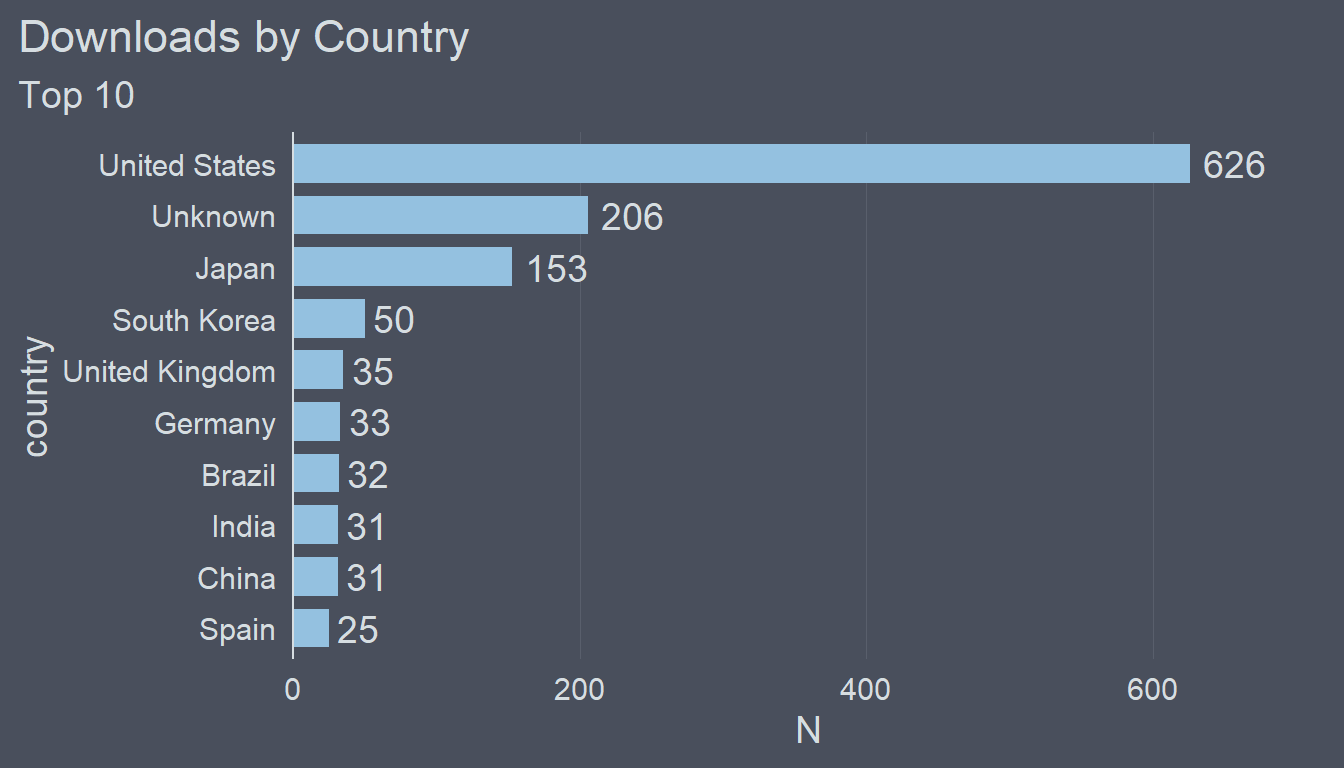
If you have no idea what I just did check out this post to learn more about labeling bar charts.
When labeling the bars I prefer not to display the x axis and remove the grid lines as well.
p4 <- p4 +
  theme(
    axis.text.x = element_blank(),
    panel.grid.major.x = element_blank()
  )
p4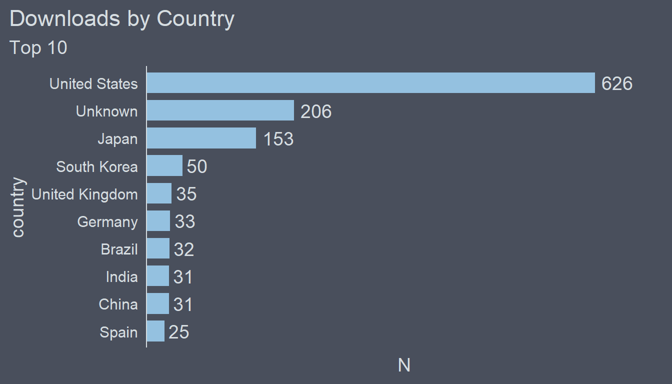
Putting it All Together
Combining these four plots into one data visualization is a piece of cake thanks to the patchwork package. Simply add them together.
p1 + p2 + p3 + p4## Warning: Removed 9 row(s) containing missing values (geom_path).
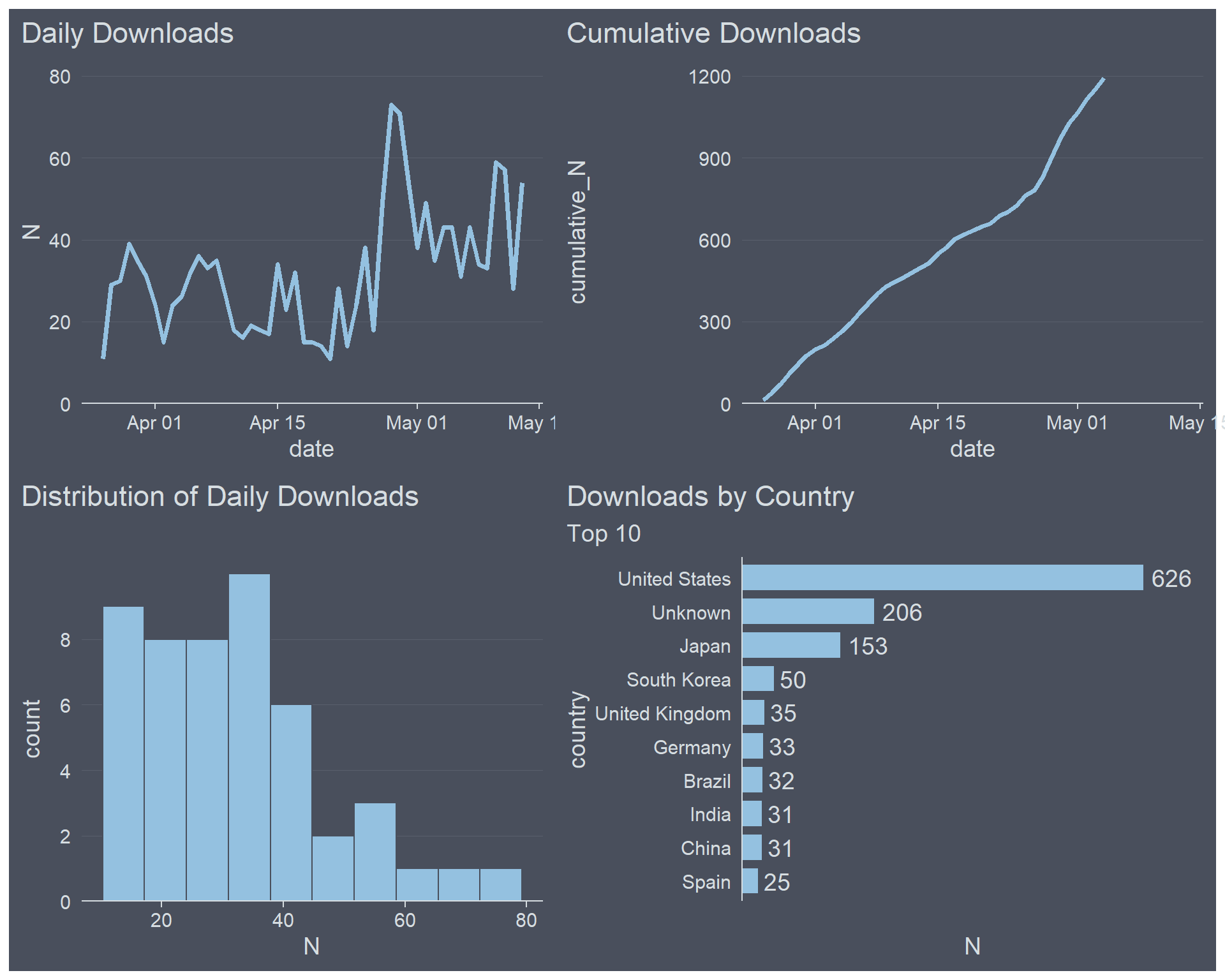
That looks quite nice. What makes this plot a bit messy though is the axis labels. I think they are redundant. It’s very clear from the titles what is displayed so having axis labels only adds visual clutter.
plot <- p1 + p2 + p3 + p4 & labs(x = NULL, y = NULL)
plot
## Warning: Removed 9 row(s) containing missing values (geom_path).
Notice that I used & instead of the usual +. By using & the labels of all plots in the patchwork are adjusted. When using + only the labels of the last plot, i.e. p4, would be changed.
Finally, let’s add an overall title, subtitle and a caption.
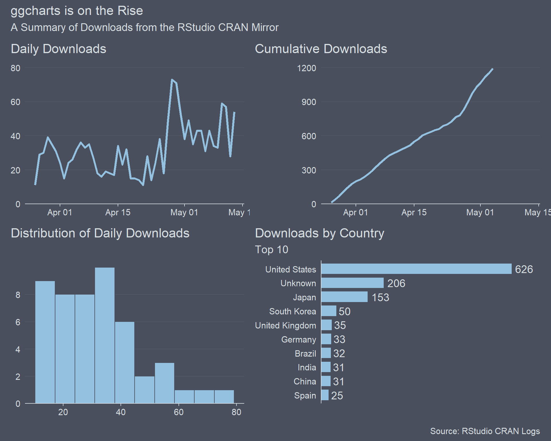
plot +
  plot_annotation(
    title = "ggcharts is on the Rise",
    subtitle = "A Summary of Downloads from the RStudio CRAN Mirror",
    caption = "Source: RStudio CRAN Logs"
  )
## Warning: Removed 9 row(s) containing missing values (geom_path).
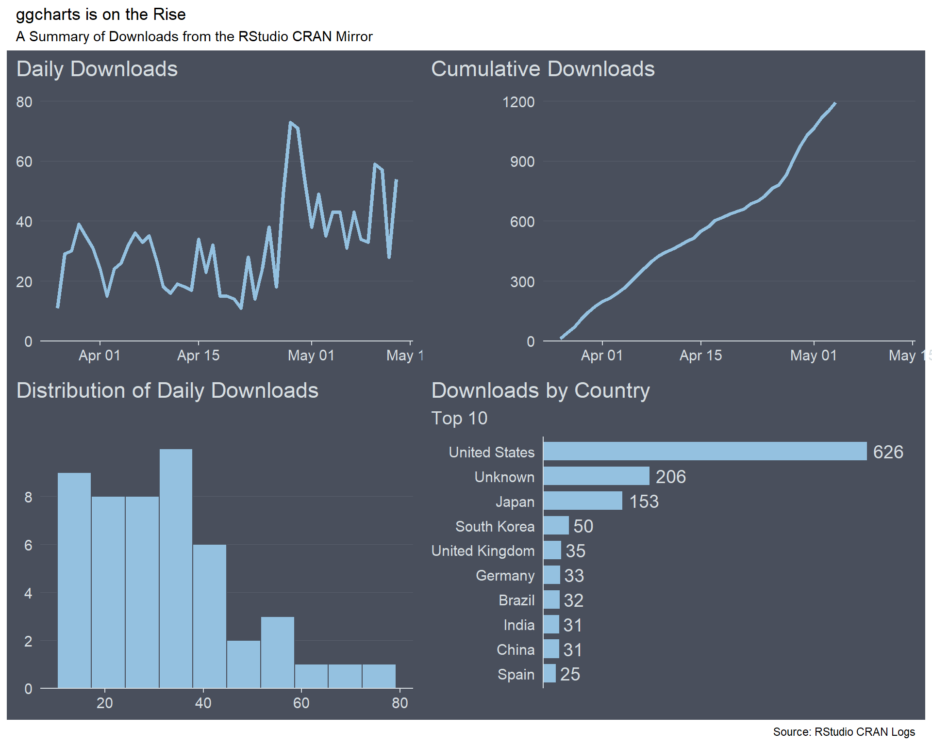
Ok, that looks awful! Fortunately, this can be fixed by passing the same theme used for the individual plots to the patchwork.
plot +
  plot_annotation(
    title = "ggcharts is on the Rise",
    subtitle = "A Summary of Downloads from the RStudio CRAN Mirror",
    caption = "Source: RStudio CRAN Logs",
    theme = ggcharts::theme_hermit()
  )
## Warning: Removed 9 row(s) containing missing values (geom_path).
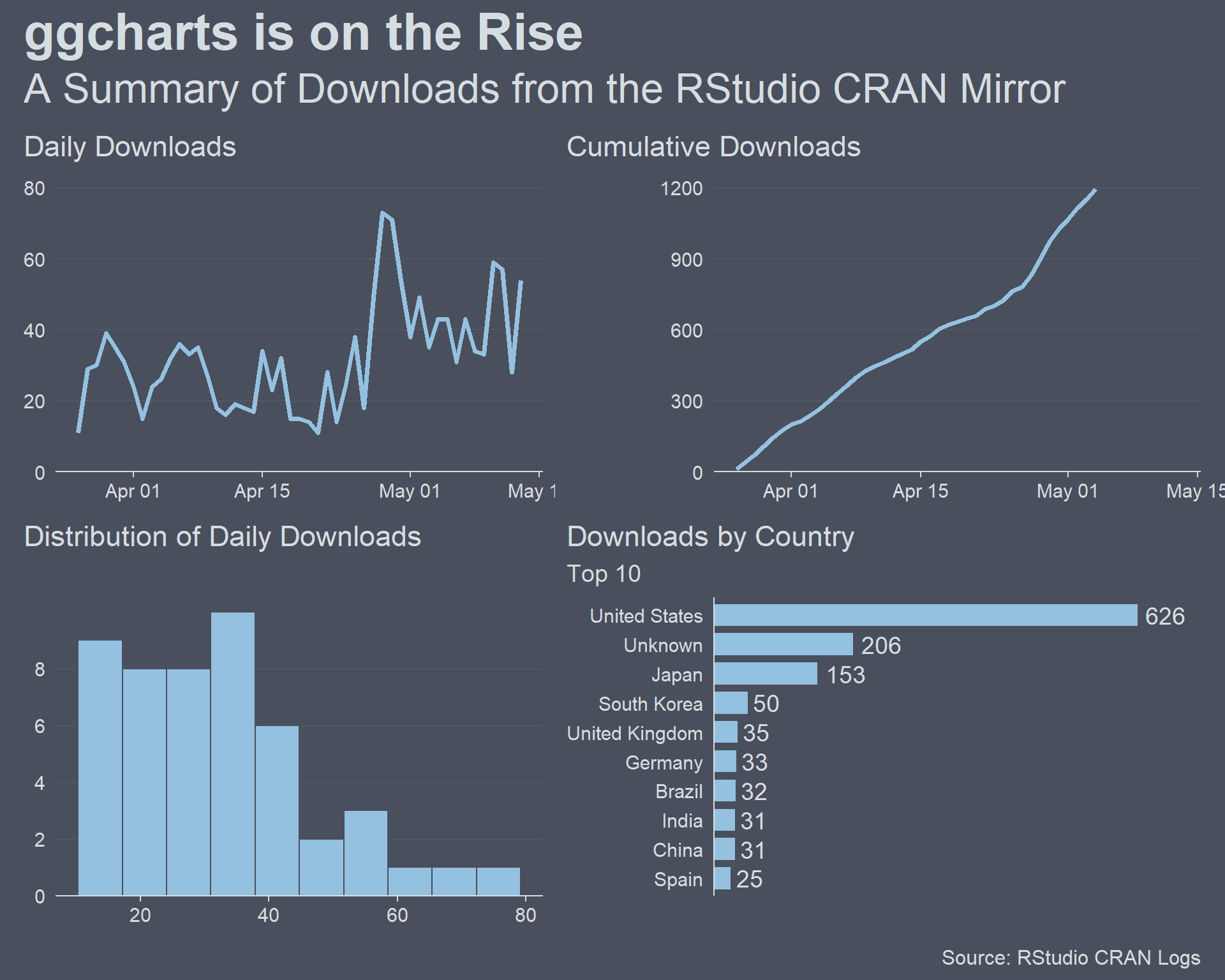
Much better, but I would prefer the overall title to be (much) larger than the titles of the individual plots. That can be achieved by tweaking the theme passed to plot_annotation().
plot_theme <- ggcharts::theme_hermit() +
  theme(
    plot.title = element_text(face = "bold", size = 30),
    plot.subtitle = element_text(size = 24),
    plot.caption = element_text(size = 12)
  )
plot <- plot +
  plot_annotation(
    title = "ggcharts is on the Rise",
    subtitle = "A Summary of Downloads from the RStudio CRAN Mirror",
    caption = "Source: RStudio CRAN Logs",
    theme = plot_theme
  )
plot
## Warning: Removed 9 row(s) containing missing values (geom_path).
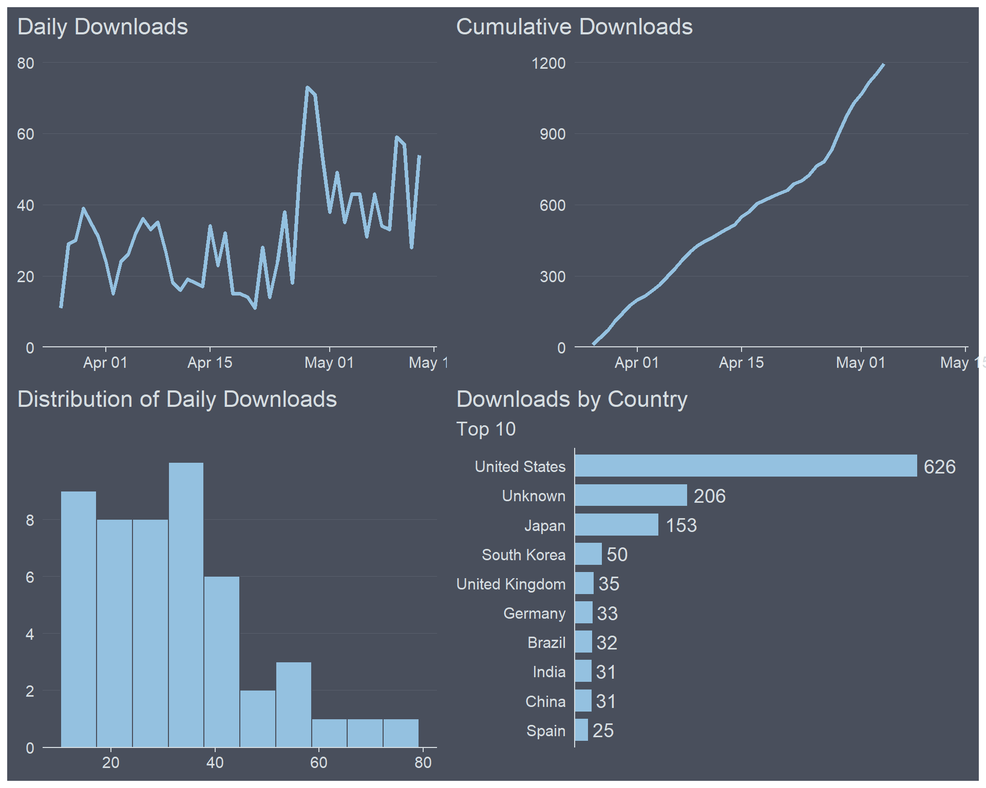
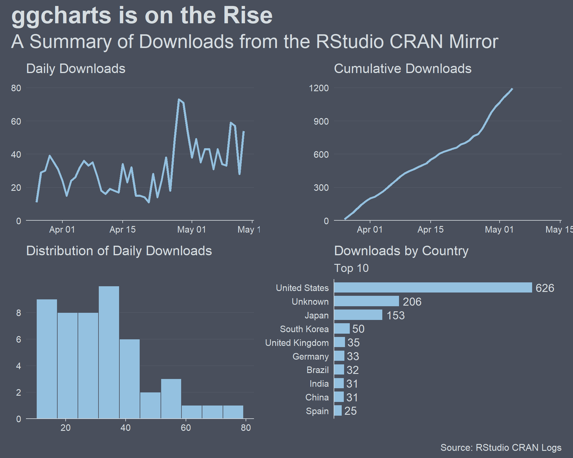
I am almost satisfied with this data visualization. One thing that bothers me is the position of the individual titles, though. They are aligned with the edge of the plot which I think is great for a stand alone plot but not for a patchwork. Let’s align them with the panel, i.e. the part of the plot that actually shows the data.
plot & theme(plot.title.position = "panel")## Warning: Removed 9 row(s) containing missing values (geom_path).
It took quite some effort to get here but I really like the end results. How about you? Let me know in the comments.
Just the Code
library(ggplot2)
library(patchwork)

p1 <- ggplot(daily_downloads, aes(date, N)) +
  geom_line(color = "#94C1E0", size = 1.25) +
  scale_y_continuous(
    limits = c(0, 80),
    expand = expansion(mult = c(0, .05))
  ) +
  ggcharts::theme_hermit(axis = "x", ticks = "x", grid = "X") +
    labs(
    x = NULL,
    y = NULL,
    title = "Daily Downloads"
  )

p2 <- ggplot(daily_downloads, aes(date, cumulative_N)) +
  geom_line(color = "#94C1E0", size = 1.25) +
  scale_y_continuous(
    limits = c(0, 1200),
    breaks = seq(from = 0, to = 1200, by = 300),
    expand = expansion(mult = c(0, .05))
  ) +
  ggcharts::theme_hermit(axis = "x", ticks = "x", grid = "X") +
  labs(
    x = NULL,
    y = NULL,
    title = "Cumulative Downloads"
  )

p3 <- ggplot(daily_downloads, aes(N)) +
  geom_histogram(fill = "#94C1E0", color = "#494F5C", bins = 10) +
  scale_y_continuous(
    breaks = c(0, 2, 4, 6, 8),
    expand = expansion(mult = c(0, .05))
  ) +
  ggcharts::theme_hermit(axis = "x", ticks = "x", grid = "X") +
  labs(
    x = NULL,
    y = NULL,
    title = "Distribution of Daily Downloads"
  )

p4 <- ggcharts::bar_chart(
  downloads_by_country,
  country, N,
  bar_color = "#94C1E0",
  top_n = 10
  ) +
  geom_text(
    mapping = aes(label = N),
    hjust = -.2,
    color = "#D6DDE1",
    size = 5
  ) +
  scale_y_continuous(expand = expansion(mult = c(0, .15))) +
  ggcharts::theme_hermit(axis = "y") +
  theme(axis.text.x = element_blank()) +
  labs(
    x = NULL,
    y = NULL,
    title = "Downloads by Country",
    subtitle = "Top 10"
  )


plot_theme <- ggcharts::theme_hermit() +
  theme(
    plot.title = element_text(face = "bold", size = 30),
    plot.subtitle = element_text(size = 24),
    plot.caption = element_text(size = 12)
  )
plot <- p1 + p2 + p3 + p4 +
  plot_annotation(
    title = "ggcharts is on the Rise",
    subtitle = "A Summary of Downloads from the RStudio CRAN Mirror",
    caption = "Source: RStudio CRAN Logs",
    theme = plot_theme
  )
plot & theme(plot.title.position = "panel")