Adding Labels to a {ggplot2} Bar Chart
This article is also available in Chinese.
I often see bar charts where the bars are directly labeled with the value they represent. In this post I will walk you through how you can create such labeled bar charts using ggplot2.
The data I will use comes from the 2019 Stackoverflow Developer Survey. To make creating the plot easier I will use the bar_chart() function from my ggcharts package which outputs a ggplot that can be customized further using any ggplot2 function.
library(dplyr)
library(ggplot2)
library(ggcharts)

dreaded_lang <- tibble::tribble(
  ~language, ~pct,
  "VBA", 75.2,
  "Objective-C", 68.7,
  "Assembly", 64.4,
  "C", 57.5,
  "PHP", 54.2,
  "Erlang", 52.6,
  "Ruby", 49.7,
  "R", 48.3,
  "C++", 48.0,
  "Java", 46.6
)

chart <- dreaded_lang %>%
  bar_chart(language, pct) %>%
  print()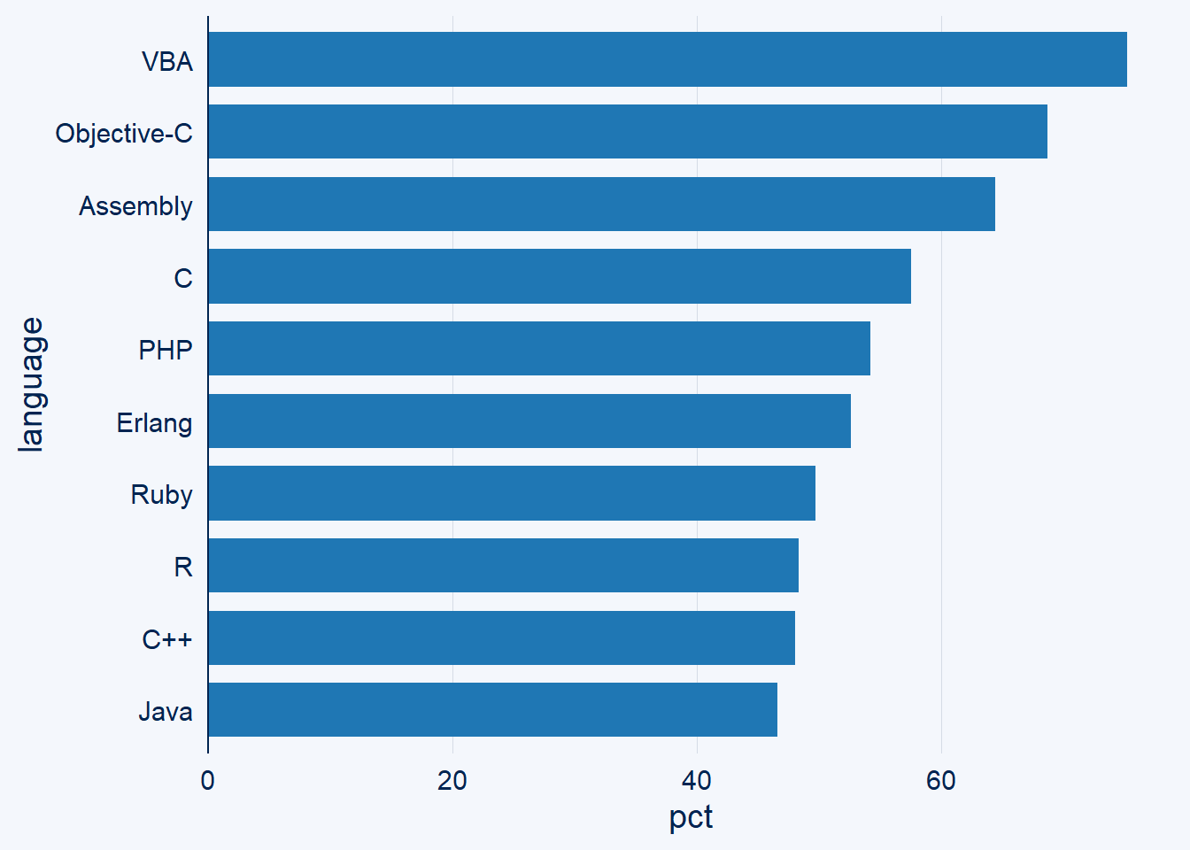
To add an annotation to the bars you’ll have to use either geom_text() or geom_label(). I will start off with the former. Both require the label aesthetic which tells ggplot2 which text to actually display. In addition, both functions require the x and y aesthetics but these are already set when using bar_chart() so I won’t bother setting them explicitly after this first example.
chart +
  geom_text(aes(x = language, y = pct, label = pct))
By default the labels are center-aligned directly at the y value. You will never want to leave it like that because it’s quite hard to read. To left-align the labels set the hjust parameter to 0 or "left".
chart +
  geom_text(aes(label = pct, hjust = "left"))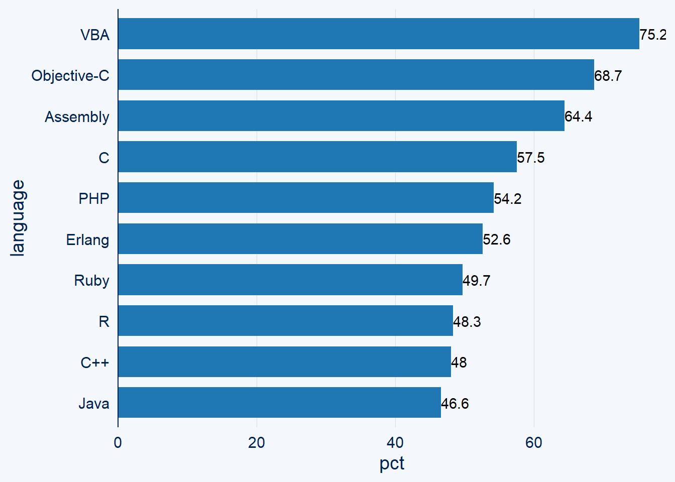
That’s still not ideal I would say. Let’s move the labels a bit further away from the bars by setting hjust to a negative number and increase the axis limits to improve the legibility of the label of the top most bar.
chart +
  geom_text(aes(label = pct, hjust = -0.2)) +
  ylim(NA, 100)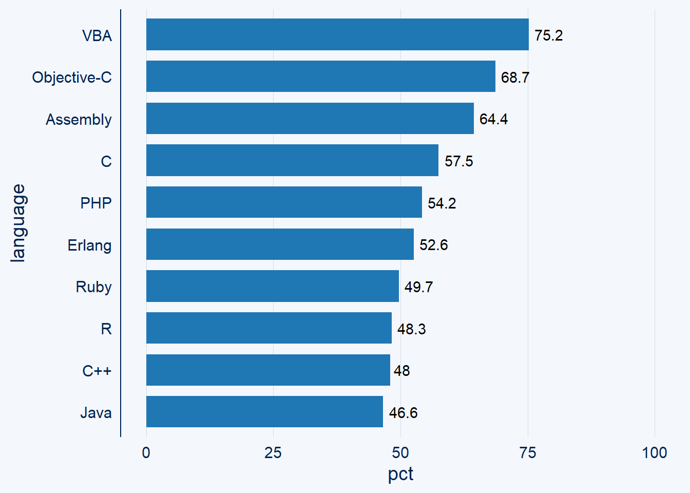
Alternatively, you may want to have the labels inside the bars.
chart +
  geom_text(aes(label = pct, hjust = 1))
Again, a bit close to the end of the bars. By increasing the hjust value the labels can be moved further to the left. In addition, black on blue is quite hard to read so let’s change the text color to white. Notice that this happens outside of aes().
chart +
  geom_text(aes(label = pct, hjust = 1.2), color = "white")
Next, let’s try geom_label() for once to see how it’s different from geom_text().
chart +
  geom_label(aes(label = pct, hjust = 1.2))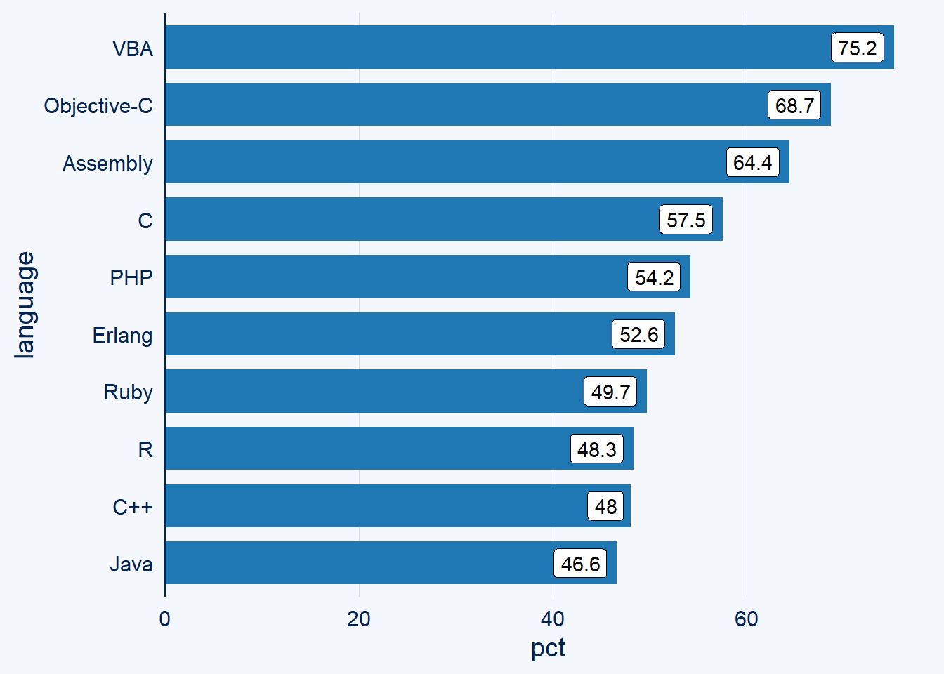
I am not a fan of this look and will stick to geom_text() for the final plot.
As the data in the plot represents percentages it’s best practice to have the labels include the percentage sign. In addition, let’s highlight our favorite language R and add title, footnotes etc.
dreaded_lang %>%
  mutate(label = sprintf("%1.1f%%", pct)) %>%
  bar_chart(language, pct, highlight = "R", bar_color = "black") +
  geom_text(aes(label = label, hjust = -0.1), size = 5) +
  scale_y_continuous(
    limits = c(0, 100),
    expand = expansion()
  ) +
  labs(
    x = NULL,
    y = "Developers Who are Developing with the Language but<br>Have not Expressed Interest in Continuing to Do so",
    title = "Top 10 Most Dreaded Programming Languages",
    subtitle = "*R Placed 8th*",
    caption = "Source: Stackoverflow Developer Survey 2019"
  ) +
  mdthemes::md_theme_classic(base_size = 14) +
  theme(
    axis.text.x = element_blank(),
    axis.line.x = element_blank(),
    axis.ticks.x = element_blank()
  )
Notice how easy it was to highlight a single bar thanks to ggcharts. In addition, I used my mdthemes package which provides themes that interpret text as markdown. That way is was super easy to get the subtitle in italics. Furthermore, I removed the axis labels and grid lines. In my opinion you should never have an axis and labels in the same plot.
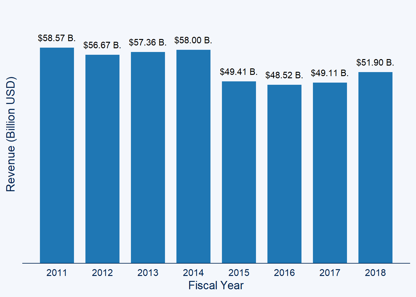
To finish off this post, let’s have a quick look at how to label a vertical bar chart. It’s basically the same process but instead of using hjust you will need to use vjust to adjust the label position.
data("biomedicalrevenue")

biomedicalrevenue %>%
  filter(company == "Novartis") %>%
  mutate(label = sprintf("$%1.2f B.", revenue)) %>%
  column_chart(year, revenue) +
  geom_text(aes(label = label, vjust = -1)) +
  theme(
    axis.text.y = element_blank(),
    panel.grid.major.y = element_blank()
  ) +
  scale_x_continuous(
    name = "Fiscal Year",
    breaks = 2011:2018
  ) +
  scale_y_continuous(
    name = "Revenue (Billion USD)",
    limits = c(0, 70),
    expand = expansion()
  )