Transform a {ggplot2} Axis to a Percentage Scale
This article is also available in Chinese and Spanish.
When plotting a variable whose unit of measure is percent it’s best practice to have the axis labels contain the percentage sign (%). This makes it obvious to anyone looking at the data visualization that they are dealing with percentages.
To illustrate this let’s create an example dataset.
library(dplyr)
data(mtcars)

cyl <- mtcars %>%
  count(cyl) %>%
  mutate(pct = n / sum(n) * 100) %>%
  print()
## cyl n pct
## 1 4 11 34.375
## 2 6 7 21.875
## 3 8 14 43.750
To create a bar chart displaying these data I will use my ggcharts package which provides a high-level interface to produce plots using ggplot2.
library(ggcharts)
(p <- bar_chart(cyl, cyl, pct))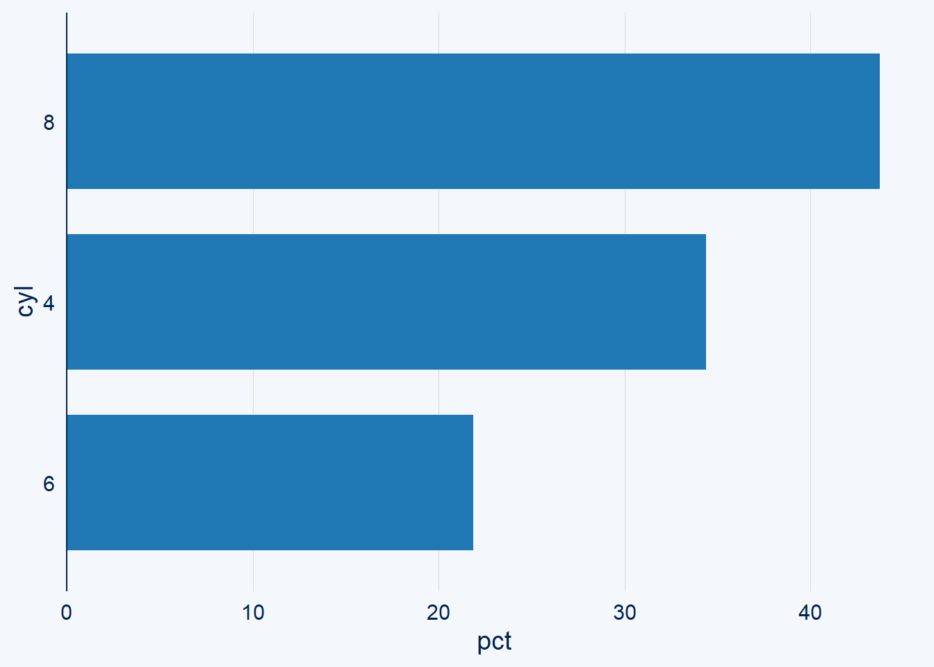
Next, let’s try to change the axis labels to include a percentage sign using the percent() function from the scales package.
p + scale_y_continuous(labels = scales::percent)
Something is not right here! 4000%!? That seems a bit excessive. The problem here is that by default scales::percent() multiplies its input value by 100. This can be controlled by the scale parameter.
scales::percent(100, scale = 1)## [1] "100%"
However, scale_y_continuous() expects a function as input for its labels parameter not the actual labels itself. Thus, using percent() is not an option anymore. Fortunately, the scales package offers a function called percent_format() that returns the percent() function with changed defaults.
pct1 <- scales::percent_format(scale = 1)
pct1(100)
## [1] "100%"
Passing this function to labels produces the desired result.
p + scale_y_continuous(labels = scales::percent_format(scale = 1))
Alternatively, one can simply calculate a fraction instead of the actual percentage.
cyl2 <- mtcars %>%
  count(cyl) %>%
  mutate(pct = n / sum(n))

bar_chart(cyl2, cyl, pct) +
  scale_y_continuous(labels = scales::percent)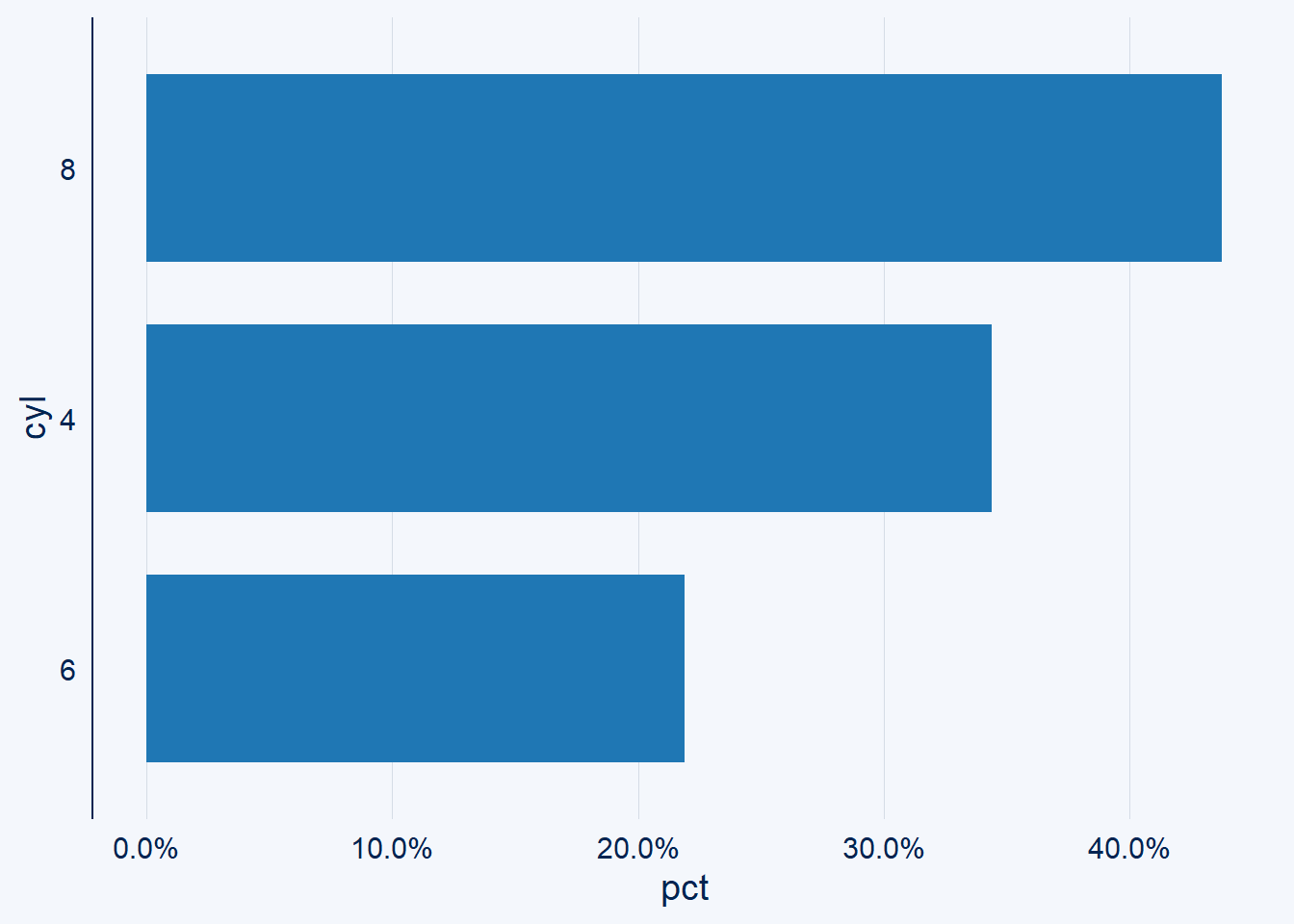
However, notice that suddenly all labels are printed with one decimal place. I think that’s undesireable given that the labels are all whole numbers.
To change this the percent_format() function has a parameter called accuracy.
bar_chart(cyl2, cyl, pct) +
  scale_y_continuous(labels = scales::percent_format(accuracy = 1))
To me all of this is confusing (to say the least). That’s why I decided to come up with a better solution. After all, it should be possible to determine scale and accuracy directly from the data, right?
My solution is the scale_y_pct() function which is part of my scalesextra package.
library(scalesextra)
bar_chart(cyl, cyl, pct) + scale_y_pct()
bar_chart(cyl2, cyl, pct) + scale_y_pct()
As you can see, regardless of whether your data is a fraction of 1 or a true percentage the data is scaled correctly. Furthermore, in both cases no decimal is displayed as all labels are integers.
You can pass any parameter of scale_y_continuous() to scale_y_pct(), e.g. breaks.
bar_chart(cyl, cyl, pct) + scale_y_pct(breaks = c(12.5, 30.75))
Notice that the number of decimal places displayed is consistent for all labels and automatically determined from the value with the highest number of decimal places. Again, this does not happen automatically when using percent_format().
bar_chart(cyl, cyl, pct) +
  scale_y_continuous(
    labels = scales::percent_format(scale = 1),
    breaks = c(12.5, 30.75)
  )
scalesextra is in very early development and thus only available from GitHub. You can install it by running these commands in you R console.
if (!"remotes" %in% installed.packages()) {
  install.packages("remotes")
}
remotes::install_github("thomas-neitmann/scalesextra")
Please test scale_y_pct() (and its sister scale_x_pct()) and let me know what you think in the comments. Should you find a bug (which is likely given the early stage of development), please open an issue on GitHub.