{ggcharts 0.2.0} is on CRAN
Introduction
A week ago the second release of my {ggcharts} package was published on CRAN. {ggcharts} aims to get you to your desired plot faster. It provides a high-level interface for creating common plots using {ggplot2} and does the heavy lifting for you. The resulting plots are ggplot objects so you can further tweak them using any {ggplot2} function.
Major new feature: themes
The major focus of version 0.2.0 was adding themes to the package. Let’s have a look at them.
library(ggcharts)## Loading required package: ggplot2
library(patchwork)
base_plot <- ggplot(mtcars, aes(hp, mpg)) +
  geom_point(color = "gray")
p1 <- base_plot + theme_ggcharts()
p2 <- base_plot + theme_hermit()
p3 <- base_plot + theme_ng()
p4 <- base_plot + theme_nightblue()
p1 + p2 + p3 + p4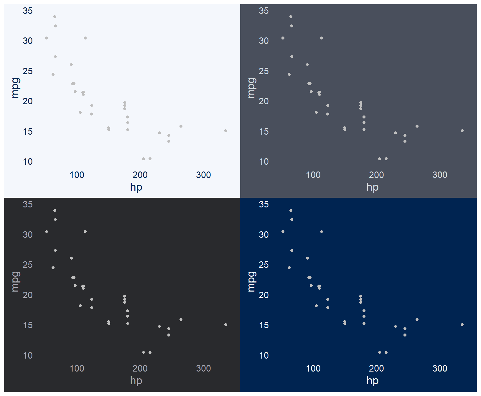
As you can see the themes are very minimal by default. They don’t have any axis lines, ticks or grid lines. This is intentional. Different combinations of these parameters work best for different plots. You should make a conscious decision which to use rather than relying on some arbitrary default.
Customize the themes
All {ggcharts} themes have a axis, ticks and grid parameter for drawing axis lines, axis ticks and grid lines, respectively. Apart from colors and fonts these are the major style elements of a theme.
Let’s have a look how to use those parameters. For the scatter plot I created above grid lines work well.
base_plot + theme_ng(grid = "XY")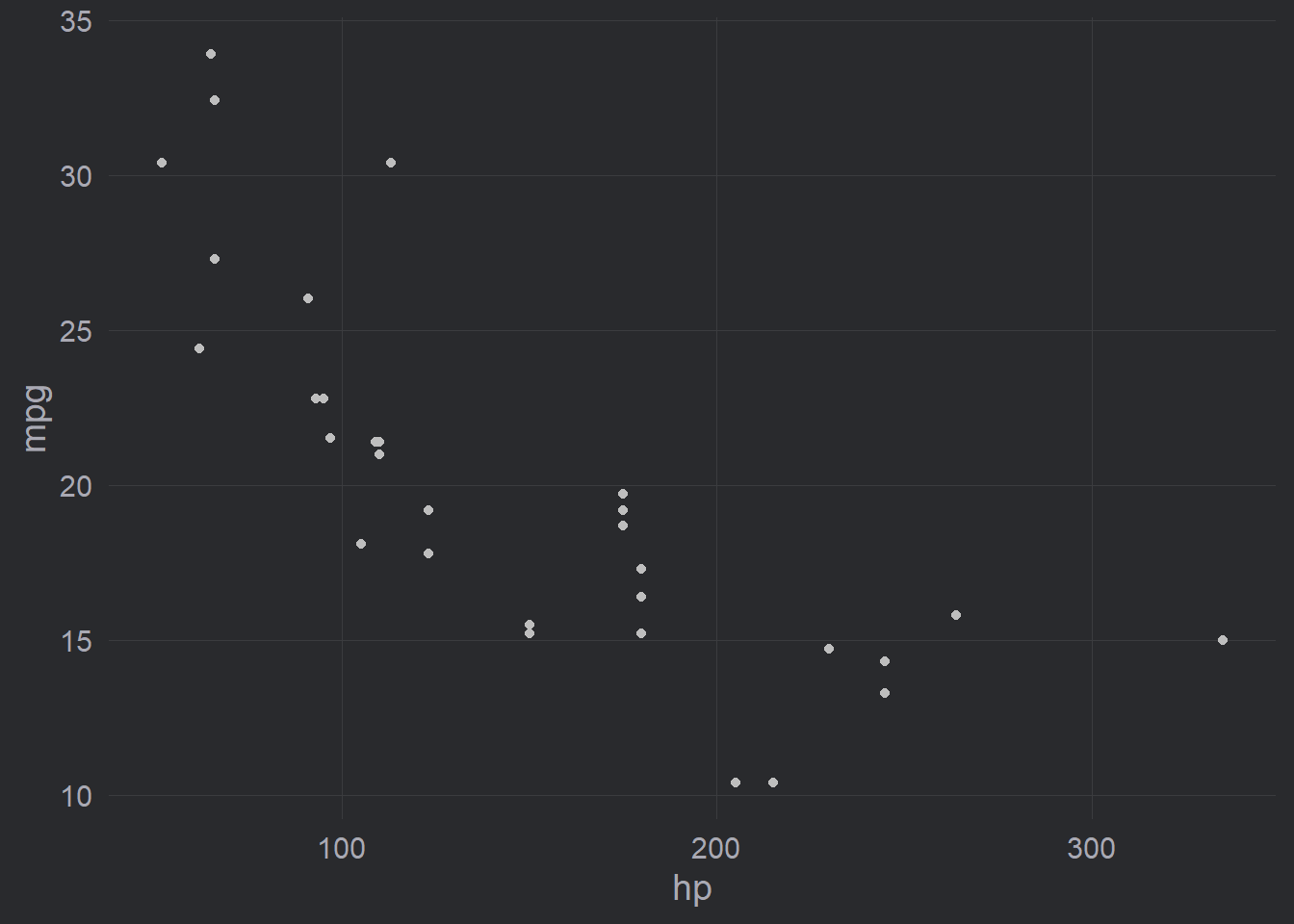
Note that I used uppercase "XY" which draws major grid lines. To draw minor grid lines use lowercase "xy"instead.
An alternative option for this scatter plot is to go for axis lines with ticks.
base_plot + theme_ng(axis = "xy", ticks = "xy")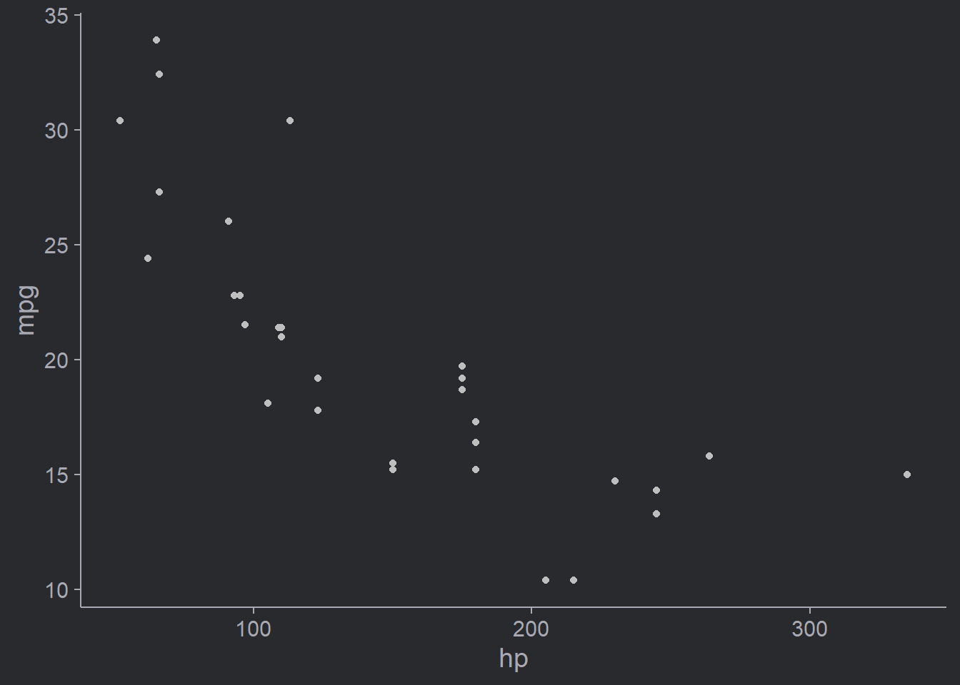
Easy, isn’t it?
The API is inspired by the {hrbrthemes} package. You hopefully agree that it is much easier to tweak the theme this way than using the theme() function. Consider this example which creates the same plot as above but is full of boiler-plate code.
base_plot +
  theme_ng() +
  theme(
    axis.line.x = element_line(color = "#A9A9B3"),
    axis.line.y = element_line(color = "#A9A9B3"),
    axis.ticks.x = element_line(color = "#A9A9B3"),
    axis.ticks.y = element_line(color = "#A9A9B3")
  )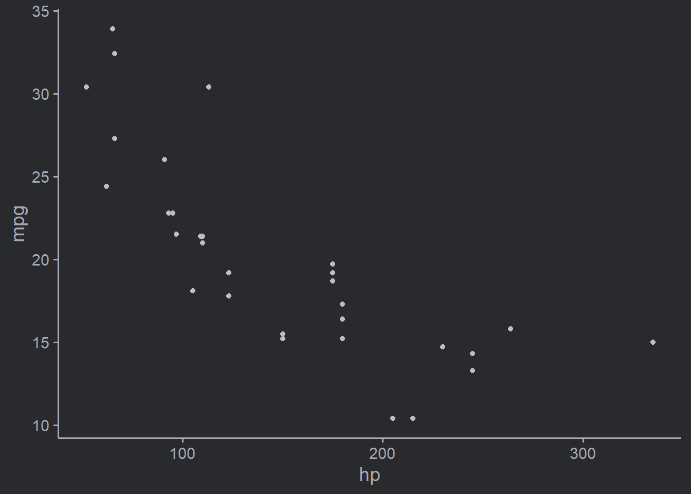
Convinced? Great, let’s move on!
Change {ggcharts} theme globally
{ggcharts} uses theme_ggcharts() by default and sets the axis, ticks and grid arguments automatically depending on the plot.
data("biomedicalrevenue")
revenue2018 <- biomedicalrevenue[biomedicalrevenue$year == 2018, ]
lollipop_chart(revenue2018, company, revenue, threshold = 30)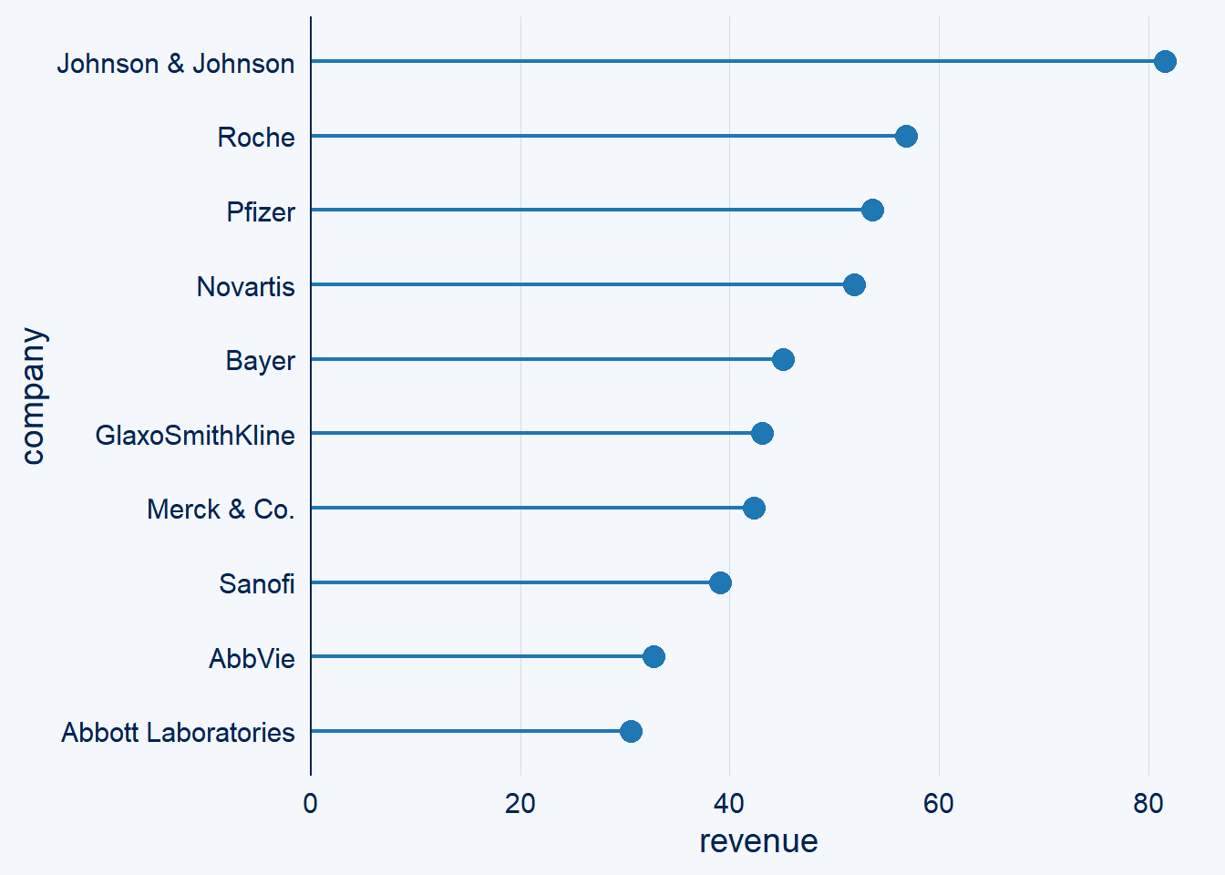
For the horizontal lollipop_chart(), axis = "y", ticks = "" and grid = "Y".
In addition to the four themes, version 0.2.0 of {ggcharts} adds the ability to change the theme globally using ggchart_set_theme(). This is similar to theme_set() from {ggplot2}. Unlike theme_set(), though, ggcharts_set_theme() takes the name of the theme as a string as its first argument, e.g. ggcharts_set_theme("theme_hermit"). Why? Because if you would pass the theme directly it couldn’t easily be auto-adjusted depending of the chart.
Setting the theme globally has further advantages. The default color is also changed in sync. This is unlike the geom defaults of {ggplot2} which remain unchanged if you change the theme. Additionally, if you use the highlight parameter the color of the non-highlighted bars is auto-adjusted as well. Here’s an example.
revenue2018 <- biomedicalrevenue[biomedicalrevenue$year == 2018, ]
themes <- ggcharts:::ggcharts_list_themes()
bar_charts <- lapply(themes, function(t) {
  ggcharts_set_theme(t, base_size = 12)
  bar_chart(
    revenue2018,
    company,
    revenue,
    highlight = "Roche",
    top_n = 7
  )
})
wrap_plots(bar_charts)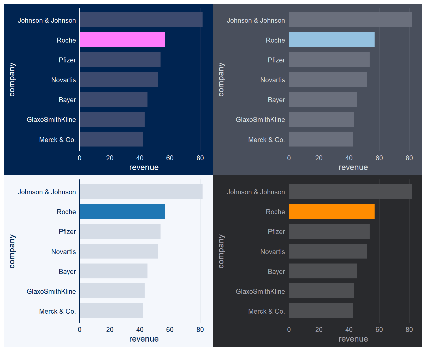
Neat isn’t, it?
Improved highlight feature
Speaking of highlighting, another new feature in version 0.2.0 is highlight_spec() which gives you full control over the way in which bars and lollipops are highlighted in bar_chart() and lollipop_chart(), respectively.
Let’s take the bar chart from above and say you’d like to highlight the bars of "Roche" and "Novartis" in two different colors and use a lighter gray as the color for the other bars.
spec <- highlight_spec(
  what = c("Roche", "Novartis"),
  highlight_color = c("#0066CC", "#E8580F"),
  other_color = "#F0F0F0"
)
bar_chart(revenue2018, company, revenue, highlight = spec) +
  theme_classic()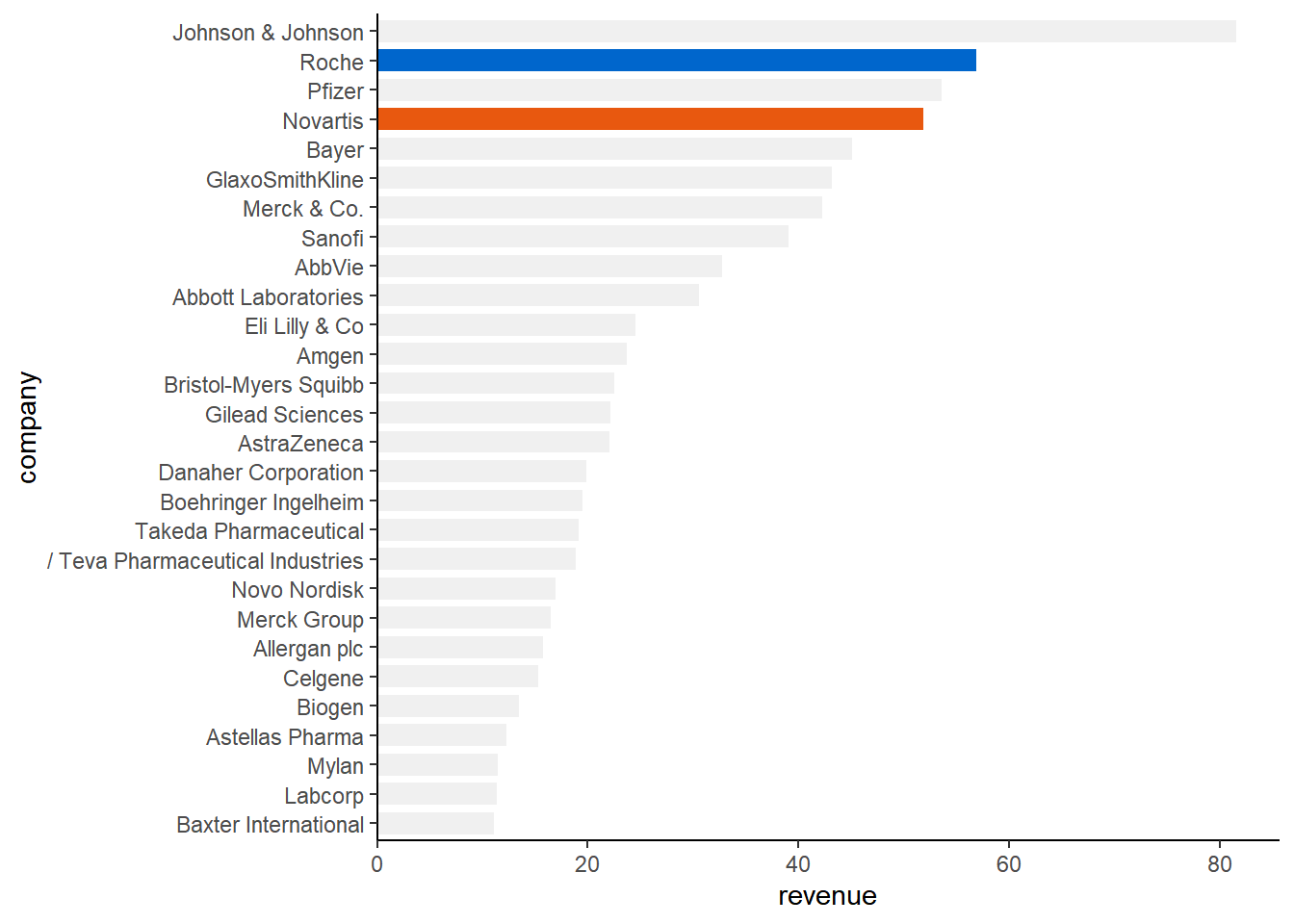
Concluding Remarks
{ggcharts} is a work-in-progress and constantly evolving. After the recent CRAN release I already added one new feature: line_chart(). If there’s something you’d like to see in the package please open an issue on GitHub.
If you haven’t already, make sure to install the new {ggcharts} release:
install.packages("ggcharts")If you want to learn more about the package, the best place is the package website.
Finally, if you like the package please star it on GitHub.