Creating dumbbell charts with the ggcharts R package
library(ggcharts)
library(dplyr)
library(gapminder)
data(gapminder)
I am very pleased to announce that my ggcharts package has a new feature: dumbbell_chart().
To showcase this new function I will use the gapminder dataset which contains countries’ population counts from 1952 to 2017. This dataset is in long format. In order for dumbbell_chart() to work properly the data has to be in wide format, though. So, first a bit of data wrangling.
gapminder_wide <- gapminder %>%
  mutate(pop = pop / 1e6) %>%
  filter(year %in% c(1952, 2007)) %>%
  tidyr::pivot_wider(
    id_cols = country,
    names_from = year,
    values_from = pop,
    names_prefix = "pop_"
  )
gapminder_wide
## # A tibble: 142 x 3
## country pop_1952 pop_2007
## <fct> <dbl> <dbl>
## 1 Afghanistan 8.43 31.9
## 2 Albania 1.28 3.60
## 3 Algeria 9.28 33.3
## 4 Angola 4.23 12.4
## 5 Argentina 17.9 40.3
## 6 Australia 8.69 20.4
## 7 Austria 6.93 8.20
## 8 Bahrain 0.120 0.709
## 9 Bangladesh 46.9 150.
## 10 Belgium 8.73 10.4
## # ... with 132 more rows
With the data being ready, let’s create a simple chart.
dumbbell_chart(gapminder_wide, country, pop_1952, pop_2007,
               limit = 10)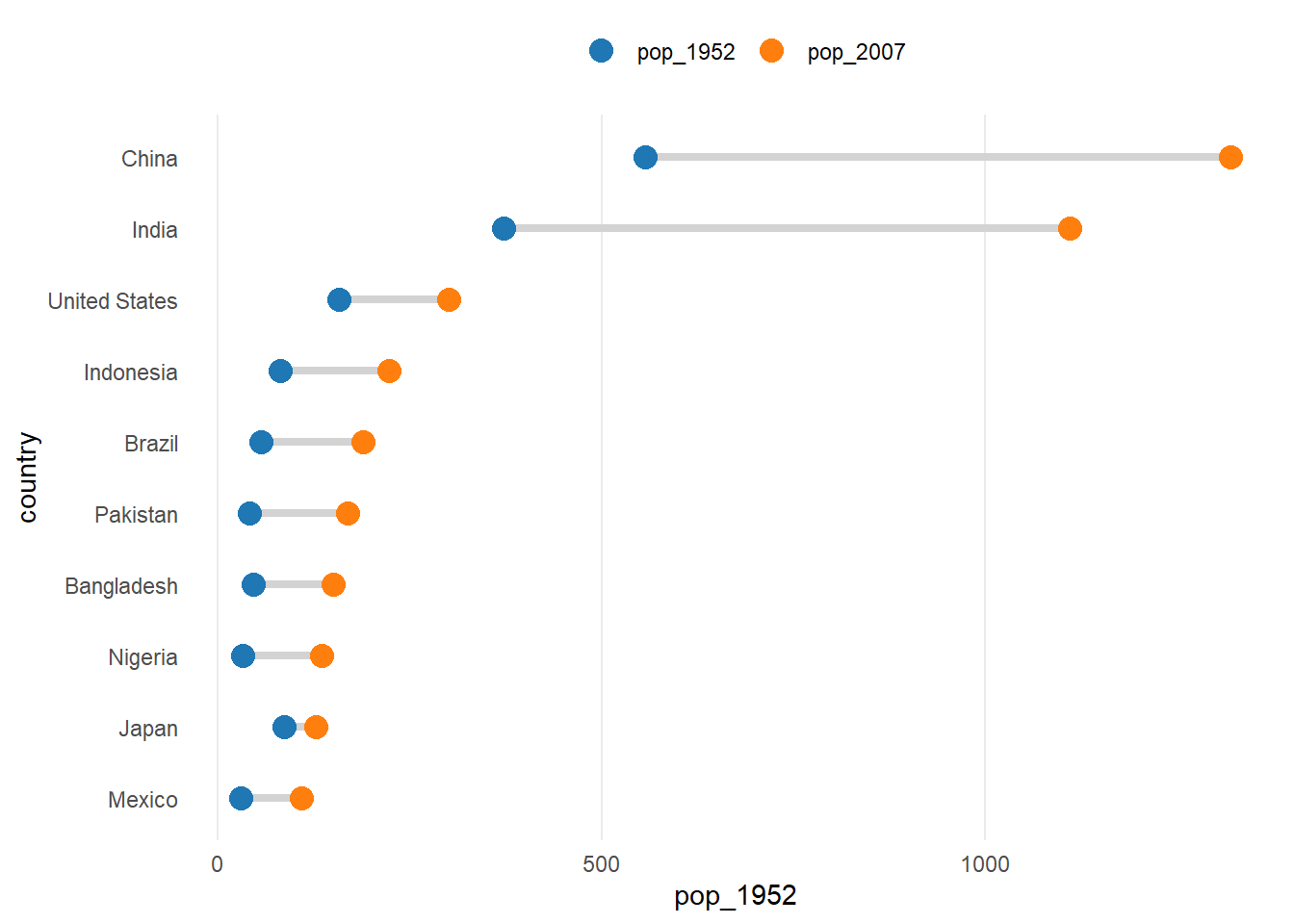
That looks already quite nice but let’s customize the plot to make it look even better. First, let’s see which customizations can be done by changing the defaults of dumbbell_chart().
chart <- dumbbell_chart(gapminder_wide, country, pop_1952, pop_2007,
                        limit = 10, point_size = 5,
                        point_colors = c("lightgray", "black"),
                        legend_labels = c("1952", "2007"))
chart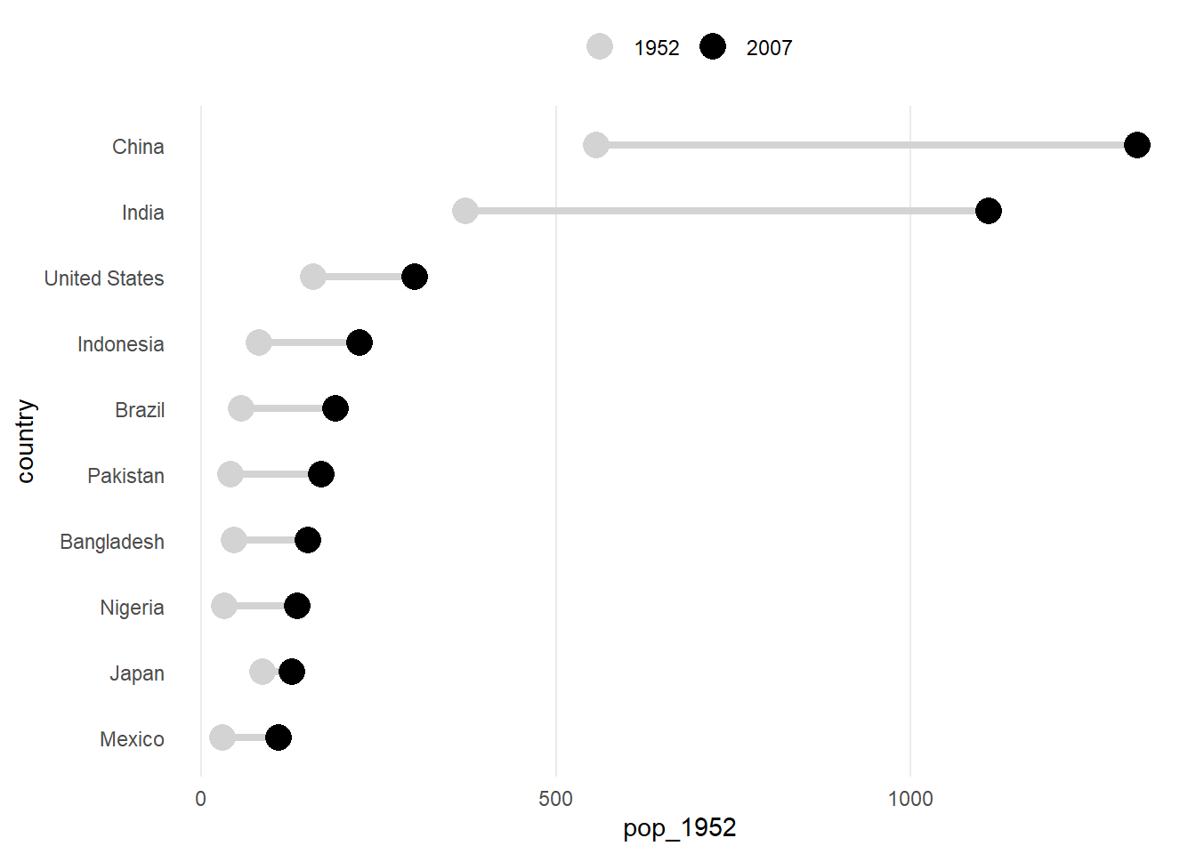
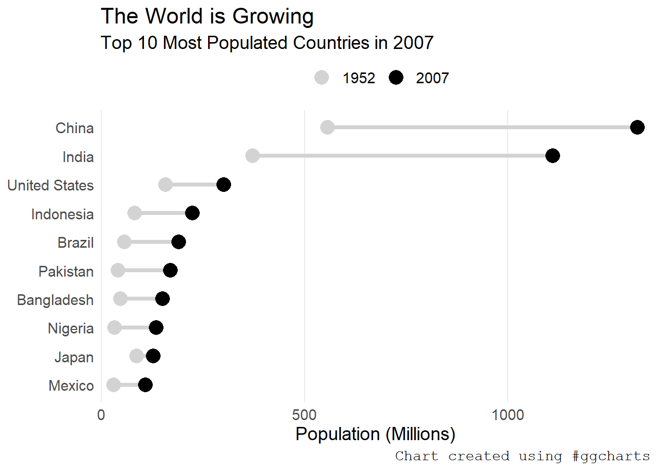
To further customize the plot you can use ggplot2 functions.
chart +
  scale_y_continuous(expand = expand_scale(mult = .025)) +
  theme(
    text = element_text(size = 14),
    plot.caption = element_text(family = "mono")
  ) +
  labs(
    title = "The World is Growing",
    subtitle = "Top 10 Most Populated Countries in 2007",
    caption = "Chart created using #ggcharts"
  ) +
  xlab(NULL) +
  ylab("Population (Millions)")